There are a lot a ways to get feedback. But I believe taking the simple approach and learn from things around us is always. I found Apple did something I really liked on the topic. Apple is not a premiere company on usability. I actually believe there ability to lead is hampered by elitism. But they do create good things from time-to-time. The feedback function on their new Safari beta app is a great example.
Immediate feedback is a good source of usability. Like surveys after a training, or clickers during a class. What Apple did was integrate this into a software app. They added this button in the top right of the beta app:

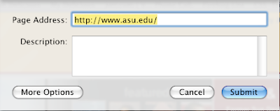
The button takes you to this window:

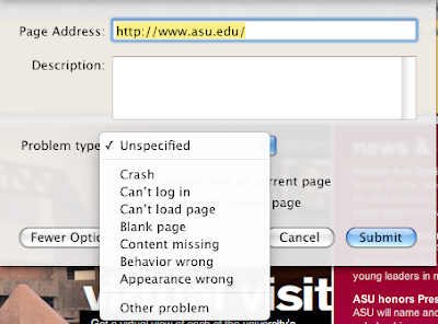
If you click on "More Options" you get this:

That is what I call usability in action.
- Clear, simple, and nimble way to get an opinion.
- Easy as picking up a pencil.
- The taxonomy/structured content is the second option, not the first.


No comments:
Post a Comment