
October 3, 2009
August 30, 2009
August 27, 2009
Tag Cloud
When used with a purpose, I like tag clouds. It is a powerful visualization of words used to communicate a message. I went to www.wordle.net and created a tag cloud of this blog:

This is a great tool. Creating this tag cloud hits several major principals of usability. It is effective, efficient, and with a quick user satisfaction ( just look at it to immediately understand it.)

This is a great tool. Creating this tag cloud hits several major principals of usability. It is effective, efficient, and with a quick user satisfaction ( just look at it to immediately understand it.)
Sustainability
I don't have to tell you that technology changes fast:
So I believe a way to help us keep up with how fast technology changes is by adding the objective of Sustainability to Usability.
So I believe a way to help us keep up with how fast technology changes is by adding the objective of Sustainability to Usability.
- Sustainability: change management
August 21, 2009
I don't want to ask for directions!
 I was fortunate today to have a chance to talk to one of our new students at ASU. While waiting for the Flash bus (a bus used by most ASU student to get from lot 59 to around campus), she asked, "How do you know where the stops are and communicate to the driver were you need to get off?" I can see how a question like this by a college student could trouble many. But it made me think, was it about her, or was it was it the scenario show was put in. One expectation we have entrenched in today's generation is that if you have a question, it is your responsibility at ask.
"Their are no stupid questions," we say.To support this, we need to be clear on how one will learn a task. Yes she would have learned what to do and be ok by just riding the bus for a few seconds. So in her case she would have learned by experience. But assuming to do the same thing with software can be deadly. People need to know if its best for a person to learn by reading instructions, or is it easier to understand by intuition and experience. Making people feel at ease will allow people to focus faster on getting the results they want.
Men have been attacked on this for years:
"Read the instructions", "ask for directions!" they say.
I believe most men are working from two facts:
- The balance between, "You don't need to read the instructions if it is easy enough," (and pride).... "I am smart enough to figure this out myself."
- I have more control of what I am doing and gain better experience than to follow someone's opinion.
We do learn everything by two things: By reading the instructions, or by experience. To better communicate a product's usability, we need to direct a customers expectations on the best way to engage a product. This can be the difference between creating a fan, and a raving fan.
August 20, 2009
Today's definition.
I found that my definition of usability scope gets more defined each day. Today, this is my scope of usability. The application of it, is another story.
- A clear defined path from newbie to result.
- Use of intuition to foster use.
- Clear communication of default.
- Clarity to
- customize an application to ones needs
- see the line between what the app has and needs for future development
- what is the best way to influence development. (Basically, to be heard.)
August 10, 2009
Changing of the tag line
"If it's not usable, it is inexcusable."
...has been this blog's tag line now for a while. But it has been my experience so far that many people use it to put usability in a box. Humans tend to do that with information to handle stimulus. But in this case, I believe a change is necessary to keep the focus not on what usability should be, but what it can do. So here is my new tag line:
"Bringing information into our world, on our terms."I got the inspiration after hearing the last words said on TED Talks David Merrill demos Siftables presentation.
To truly understand usability, it needs to be seen as ubiquitous.
August 5, 2009
Changing the Rules during the game
Google has been horrible about this. It is their two-sided sword. They are great with innovation, but they change usability of their software so often that they leave user's frustrated.
Example.Today, a friend came by my cube and asked me to help her troubleshoot why she couldn't share a Google spreadsheet like she always has done. We found out two things with her use case:
- A new message pops-up when a person trys to share a Google doc with someone. It says that the user does not have a Google account. "But we are a partner, shouldn't my work colleges have one? If they don't, why not have the system send a message saying to the recipient, "A Google doc has been shared with you.You will need to create a Google account to see the document." The person sharing the doc is Google's prime viral customer. If anyone should receive this message it should be the user that wants to see the doc.
- When we try to share the spreadsheet with more than one person, a "captacha" screen now shows that says, "Type in what you see in the image." Funny. The graphic of the image is missing and doesn't show up. I bet they added this feature for security purposes. People forget too fast that when security is added, the usability must remain as constant as possible.
August 2, 2009
Scope of Usability
- To reduce the complicated to the simple.
- Manage expectations.
- Adding & Removing features without drama.
- Making an app default as legitimate.
- Making sure feedback is heard, and result of it clearly seen.
- Clarifying and communicating the "Concept of One" path through an app to successful resolution.
- Timing
- Finding sweet spots.
- Understanding "Popularity" and managing trends.
- Closing loops.
- Understanding user routines for efficiency and identifying sustainable results.
- Identifying:
 use to assist growth path of product.
 - Abreast of the current Zeitgeist of technology to assist on understanding the scope of users expectations.
- To advocate Accessibility, Sustainability, and User Experience as part of development.
- To always refocus needs back to new users.
- To reduce documentation, Training, and Support needs.
- To create raving fans.
July 28, 2009
Laziness

Why is usability important? Why don't people just use the "Command line" to do a task? It's just laziness I tell you.I hear this argument all the time. One thing I do agree with is that laziness is the problem. But it is not of the user, it is from a developer making the interaction of a app. Yes.....making a complicated process simple is not easy. Look at the computer you are using to read this article. Windows, Mac OS, Linux..... these are all
 operating systems that are big, bulky, and to some unnecessary to use a computer. Obviously the sheer numbers of GUI users reveal the necessity. But many developers hate, shun, and try to avoid them.
I'm sorry, I'm guilty.I do not want to translate what I want into another language when I want something. You know they call it a language for a reason. How do you say, "Where is the bathroom?" in Italian.
July 27, 2009
What "User Experience" means to me
"User experience" encompasses all aspects of the end-user's interaction with the company, its services, and its products. The first requirement for an exemplary user experience is to meet the exact needs of the customer, without fuss or bother. Next comes simplicity and elegance that produce products that are a joy to own, a joy to use. True user experience goes far beyond giving customers what they say they want, or providing checklist features. In order to achieve high-quality user experience in a company's offerings there must be a seamless merging of the services of multiple disciplines, including engineering, marketing, graphical and industrial design, and interface design.
Eggs and Heat
 I was cooking eggs this morning, but I was having problems as usual. Every time I try to make eggs I end up burning a lot of it. I even tried cooking it at a low temp. But I get impatient, turn-up the heat, and end up with 1/3 of my eggs sticking to the bottom on a non-stick pan. For years I was wondering what I was doing wrong. I even gave up and just let my wife cook the eggs. But today I realized the level of heat dictates my user experience.
When I had the heat too high, I believe I had to watch it all the time and stir it. I ended up with a result of being stressed, frustrated, and much of my eggs sticking to a bottom of a non-stick pan.
But if I cooked it too low, I got an equally worst result. Inpatients takes over, my stomach ask, "why is it taking so long?" I then turn-up the heat. I feel better for a moment, but it gets a bad result fast and adds a unwanted instability. The amount of Heat in cooking the eggs dictates my usability of eating eggs, and my user experience in making them.
Just as heat can affect a cooking experience. The level of stress around a technology enhancement can have a drastic affect on its use.
Heat:
- No tracking of progress of work. (Too little heat.)
- "Too many cooks in the kitchen." (Too much heat.)
- Not lead by business processes. (Changing heat.)
- Not communicating the impact of one's feedback. (Not knowing when to take it off the stove.)
Two main development usability areas to help control heat:
The default setting:
- Simplistic and clear on how one will quickly reach a result.
- No apparent need for customization, but options are clear and simple to make the app your own.
- Focus placed on the "path most taken" to success.
- Every adoption of an enhancement must be vetted, and knowledge gained added to lessons learned(history).
- One enhancement will always generate request for others. This is the time to start a transparent list of request. Maintenance of this will be the version control of the app.
July 24, 2009
Paradigm Shift: Usability vs. User Experience
I have to say, reading and taking in the last post has been tremendous on how one looks at usability. It makes this whole process appear a lot more clear. To facilitate and understand the difference between Usability vs. User experience, I started this comparison.
Cross over:
Cross over:
- Timing
- value
- Simplicity
- Consistency
- Marketing
- Communication
- Excellence, Access, Impact
- Prune Concentrate
- amazon.com-ification
- Accessibility
- Feedback
- Expectations
- user centered design
- Raving Fans
- Ubiquitous computing
- Routine
- Stability
- Sustainability
- Invisibility
- Function to form
- Core vs. Context
- The digital divide
- Adoption
- Statistics of use
- History and revisions
- Change control
- Effort Reporting
- Navigation, Tagging, and Taxonomy
- Annual events
- Enterprise development
- Complexity control
- Beta Testing and focus groups
- Fighting against assumptions
- Form to function
- Design
- Trends
- Flair
- CSS
- Annoucements
- 1:1 development
July 23, 2009
Article: The Battle Between Usability vs. User Experience
I found this article today. It really adds focus to usability. It highlights the difference and why they need to be different, and the strength of both:
http://www.baekdal.com/articles/Usability/usabilty-vs-user-experience-battle/


http://www.baekdal.com/articles/Usability/usabilty-vs-user-experience-battle/
The Battle Between Usability and User-Experience
The main reasons why it is so hard to create usable products is that there is a conflict between a high-usability level and great user-experience. You might think this as strange, but there is a important difference between the two.
Usability
Usability is about the "ability to use" something. The aim for a usable product is to make it easy to use.
A product has a high level of usability when:
- It requires less mental effort to use
- the frequency of mistakes using it is less, or when the mistakes are less disastrous
- it is more powerful, where "more powerful" means that it can be used to do more or do it faster
- it is more learnable, that is, when a person can figure it out quicker
(source: Rensselaer Polytechnic Institute)
Making usable products is thus fairly simple. You have clear metrics you need to achieve, and you can analyze how to get a good result.
User-Experience
User-experience is not like usability - it is about feelings. The aim here is to create happiness. You want people to feel happy before, during and after they have used your product. To do that you need to take all kinds of things into consideration. Things like:
- Environment
- Colors moods
- Smell
- Touch
- Audio feedback
- Visual feedback
- Trust
- Branding
- Show-off effect
- Usefulness
- Practicality
- Coexistence
- Emotional effect
- Etc...
This is much much much harder to achieve. None of these things can be accurately analyzed. It is a touchy feeling kind of thing.
Why, for instance, does a Audi S6 give you a much better user-experience than a Ford Focus? I mean, in terms of usability they are pretty much the same.
The difference illustrated
Take roads. A Usable road is one that is wide and straight (less mental effort), with no oncoming traffic (less mistakes, less mental effort). One that enables you to get from A too B as fast as possible (more powerful) and one that has a consistent and clear use of signs (high learnability).
In short the most usable road is a freeway. But, a freeway is also directly boring in terms of user-experience.
A road with a high level of user-experience is completely different. It is a twisting mountain road (visual). Now you got great scenery (visual, emotional), the smell of nature (smell), the excitement from the climb (and the sheer cliff only feet away). You got little friendly signs put out by the local, who sells fruits along your way (show-off effect). Every city is slightly different (branding, emotional, environment). You feel happy when you see the locals wave when you pass by, and you stop let a sheep pass (emotional, trust, coexistence).
But a mountain road is far from a usable road. It is much harder to drive on, it is difficult to learn, you can't go as fast and the risk of making a mistake (taking a wrong turn or cashing into a sheep) is much greater. But, a mountain road will give you a much better user-experience than any freeway could ever do.
Creating synergy
The reason why we have so few great products is because of this difference. Most developers try to find the right balance between high usability and high user-experience. A bit like trying to turn a mountain road into a freeway. It simply does not work. You end up with mediocrity.
Instead you need to create a synergy. A Synergy is when 2 + 2 = 37.
This is not easy. It requires a bit of luck, a great deal of intuition (female intuition is helpful), a great sense of humble pride, and something called "usable happiness (*)".
Flickr, The Sims, Apple iPod, Ta-Da list, MySpace, Google Picasa, Virtual Earth, Audi S6, Mac Mini, any Pixar movie, and iRobot Roomba are all great examples.
* Usable happiness: is a product that is simple to use, and makes you smile every time you use it.
Make it easy to be happy
It is far from easy to create a great product on demand, but it is possible.
First of all, do not focus on usability or user-experience. Do not directly try to achieve to create synergies. Do not try to create a great product. None of these things will get you any closer.
Focus on making it easy to be happy, and usability, user-experience and greatness will come all by itself.
Instead of making a product management web application, make it easy to finish great projects. Instead of making usable instant messaging, make it easy to have interesting conversations. Instead of making a powerful web writer, make it easy to write exciting stories.
The result is that you use usability to take away all the things that distracts you from happiness, and you use the elements of user-experience to empower what people can do.
... and now you got a great product.
See Also
- Usability Analyzer (Baekdal.com, June 2006)
- Definition of User Experience Revisited, (justaddwater.dk, June 2006)
July 21, 2009
July 20, 2009
Researcher terms mobile usability an "oxymoron"
 Checkout this article on mobile phones. Usability is finally starting to get noticed:
July 17, 2009
Versioning

These days you cannot open a computer app without seeing signs like this for an upgrade. What is this all about.
The frequently you see this upgrade notices is a sign of usability. It is a good thing. The cause is usally by one of these reasons:
- A problem was found in a current feature.
- A new feature has been added to improve functionality.
- A security problem was needed to be fixed.
Seeing through the eyes of a child

"But Daddy, I don't want to park here for 3 hours." - my 4 year old son.We have signs everywhere to help on usability. But many times we make assumptions within those signs. This was a very legitimate question from my son. Because the sign is based on the assumption that you are aware that you do not have to park for 3 hours, it is up to 3 hours. We make assumptions everyday. This is a major part of us taking in the information we get day to day.
But to assume people can figure it out, or to throw stuff out their as a "right to passage" is unnecessary. To increase communication, simplicity, and adoption we need to remove assumptions from what we do. The worst of all is correlating your assumptions to the intelligence of a user. Doing this in technology is sadly seen way to much.
July 12, 2009
Why Design Cannot Lead Usability

Web design has been the leading profession that has implemented usability. Its quick results to adjust to a wide user base is one of the major reasons. But just like sustainability, usability can be applied to many things. It is more about being part of things like ubiquitous computing than boxed in by one approach. Limiting it to one profession will limit its potential for success, and can be misused and cause delay as the comic demonstrates.
July 11, 2009
Price vs. Value

One of my favorite quotes was from a Mercedes commercial:
In the background of it you hear a womans voice saying, "My father told me that there are people who know the price of everything, and the value of nothing."
We have all seen these price signs under products in store's across the United States. The price of course is clearly seen, but on many of them you can also see the "Unit price." By comparing the unit price of a products, one can see the value of a product.
It would be really nice if we all could compare technology products this way. But since all technology can't have a "posted sign," we display value by creating products that are easy to buy, easy to use(install), and easy to maintain. To make this possible to your target audience, is by usability. The more usable a product, the greater the value is placed on a product.
When a person first uses a product, they are actually looking for value. Not to respect this significant moment will cause:
- Low or slow adoption
- complaints generated by not meeting the end users expectations
- a high request for documentation and training
- a high product demand and push for completion, but only hearing "crickets" when released
The way to eliminate these things is by value. To increase value, is by succeeding in usability.
July 1, 2009
simplicity
"If you can't describe it simply, you can't use it simply." — Anon
"Simplicity means the achievement of maximum effect with minimum means." — Koichi Kawana, architect of botanical gardens
"Perfection is achieved, not when there is nothing more to add, but when there is nothing left to take away." — Antoine de Saint Exupéry
"Things should be made as simple as possible, but no simpler." — Albert Einstein (1879–1955)
"You can always recognize truth by its beauty and simplicity." — Richard Feynman (1918–1988)
"Our lives are frittered away by detail; simplify, simplify." — Henry David Thoreau (1817–1862)
"Simplicity is the ultimate sophistication." — Leonardo da Vinci (1452–1519)
joy of use
To reach "joy of use" is all about expectations, perceived efficiency or elegance.
A product becomes a "joy of use" if it meets or exceeds a users expectations.
User centered
To be user centered, is based on three assumptions.
- That the user knows what they are looking for. (Google search, content tagging, labels)
- That the user generally knows what the want, but need assistance to find the specifics. (This is where a set taxonomy comes in. (http://delicious.com/ and social bookmarking sites, menus on a website, RSS, folders)
- To be allowed to be part of a "in-group." This removes the feeling of ignorance, allows people to be aware of a path and influences, and to offering a way to communicate feedback that will make a difference. (Email, DLs, Blogs, Wiki's)
Web 2.0 and Usability

Guess what? Yes, Usability is a large part of the overused phrase, Web 2.0. This is another reason why it has perked my interest. Again from Wikipedia.org:
"Web 2.0" refers to a second generation of web development and design, that facilitates communication, secure information sharing, interoperability, and collaboration on the World Wide Web. Web 2.0 concepts have led to the development and evolution of web-based communities, hosted services, and applications such as social-networking sites, video-sharing sites, wikis, blogs, mashup and folksonomies.As the Web 2.0 Wikipedia.org photo shows, the emphasis of usability can be summed up in these three words:
- Joy of use
- Simplicity
- User centered
June 25, 2009
UIA Sighting: Beta Testing
Beta testing only focus on what a developer did. It doesn't test what a "Customer" expects to see. That information is only found during load testing after an application has gone live.
UIA Sighting: Blackberry Software

I heard of a cool software called "Zebra Crossing." But the person that was demoing it was on Google Android software and I have a Blackberry. I did a search on my computer find it and eureka! After several searches I found it. Ok now how to I get the information on my Blackberry to test it? Humm...this is a problem for anyone with a smart phone. I had to do more searching to find the picture of the link above. iTunes found a way to solve this by creating the app store. Blackberry created an app store butf ocuses more on getting money by featuring apps for money instead of having a one stop shop.
If I need software, I can go to iTunes. But Blackberry software is still scattered all over the web. When you find one you want to use, their isn't a clear and elegant way to install it test on a Blackberry. This is easy to change, let's see how long it takes.
June 24, 2009
Full Definition of Usability.
 What you see on the top of the blog is the first paragraph of how Wikipedia explains what usability is. View the entire page here:
Usability is a term used to denote the ease with which people can employ a particular tool or other human-made object in order to achieve a particular goal. Usability can also refer to the methods of measuring usability and the study of the principles behind an object's perceived efficiency or elegance.
In human-computer interaction and computer science, usability usually refers to the elegance and clarity with which the interaction with a computer program or a web site is designed. The term is also used often in the context of products like consumer electronics, or in the areas of communication, and knowledge transfer objects (such as a cookbook, a document or online help). It can also refer to the efficient design of mechanical objects such as a door handle or a hammer
Introduction
The primary notion of usability is that an object designed with a generalized users' psychology and physiology in mind is, for example:
- More efficient to use—it takes less time to accomplish a particular task
- Easier to learn—operation can be learned by observing the object
- More satisfying to use
Complex computer systems are finding their way into everyday life, and at the same time the market is becoming saturated with competing brands. This has led to usability becoming more popular and widely recognized in recent years as companies see the benefits of researching and developing their products with user-oriented instead of technology-oriented methods. By understanding and researching the interaction between product and user, the usability expert can also provide insight that is unattainable by traditional company-oriented market research. For example, after observing and interviewing users, the usability expert may identify needed functionality or design flaws that were not anticipated. A method called "contextual inquiry" does this in the naturally occurring context of the users own environment.
In the user-centered design paradigm, the product is designed with its intended users in mind at all times. In the user-driven or participatory design paradigm, some of the users become actual or de facto members of the design team.[1]
The term user friendly is often used as a synonym for usable, though it may also refer to accessibility.
There is no consensus about the relation of the terms ergonomics (or human factors) and usability. Some think of usability as the software specialization of the larger topic of ergonomics. Others view these topics as tangential, with ergonomics focusing on physiological matters (e.g., turning a door handle) and usability focusing on psychological matters (e.g., recognizing that a door can be opened by turning its handle).
Usability is also very important in website development. According to Jakob Nielsen, "Studies of user behavior on the Web find a low tolerance for difficult designs or slow sites. People don't want to wait. And they don't want to learn how to use a home page. There's no such thing as a training class or a manual for a Web site. People have to be able to grasp the functioning of the site immediately after scanning the home page—for a few seconds at most."[2] Otherwise, most casual users will simply leave the site and continue browsing—or shopping—somewhere else.
Definition
Usability is a qualitative attribute that assesses how easy user interfaces are to use. The word "usability" also refers to methods for improving ease-of-use during the design process. Usability consultant Jakob Nielsen and computer science professor Ben Shneiderman have written (separately) about a framework of system acceptability, where usability is a part of "usefulness" and is composed of:
- Learnability: How easy is it for users to accomplish basic tasks the first time they encounter the design?
- Efficiency: Once users have learned the design, how quickly can they perform tasks?
- Memorability: When users return to the design after a period of not using it, how easily can they re establish proficiency?
- Errors: How many errors do users make, how severe are these errors, and how easily can they recover from the errors?
- Satisfaction: How pleasant is it to use the design?
Usability is often associated with the functionalities of the product (cf. ISO definition, below), in addition to being solely a characteristic of the user interface (cf. framework of system acceptability, also below, which separates usefulness into utility and usability). For example, in the context of mainstream consumer products, an automobile lacking a reverse gear could be considered unusable according to the former view, and lacking in utility according to the latter view.
When evaluating user interfaces for usability, the definition can be as simple as "the perception of a target user of the effectiveness (fit for purpose) and efficiency (work or time required to use) of the Interface". Each component may be measured subjectively against criteria e.g. Principles of User Interface Design, to provide a metric, often expressed as a percentage.
It is important to distinguish between usability testing and usability engineering. Usability testing is the measurement of ease of use of a product or piece of software. In contrast, usability engineering (UE) is the research and design process that ensures a product with good usability.
Usability is an example of a non-functional requirement. As with other non-functional requirements, usability cannot be directly measured but must be quantified by means of indirect measures or attributes such as, for example, the number of reported problems with ease-of-use of a system.
UIA Sighting: Fax Machines
 Page up, page down. Confirmation, need confirmation. Why is every fax machine different? After all of these years the fax machine has never adjusted to the user. Standards between on brand of machine and another has never materialized. It is a tool that is control by technology and is not customer focused. I am so glad email has replaced fax machines. It would be completely gone if their wasn't a better way to handle signatures and receipts.
June 21, 2009
Exact Change

I was born and raised in Jersey City, New Jersey. I have taken more buses than I can count. Thinking back.....the thing I remember the most is seeing exact change signs.
Fare 55 cents. EXACT CHANGE ONLY."(Yeah that was a long time ago.)They made sure it was the first thing you saw when entering the bus.
 I didn't realize how long these signs have been around till I saw this photo."EXACT FARE" is written on the right of the door. Amazing. This is one of the oldest form of recorded usability I've seen in the US. Why?? Ok, I'm going to drop some Sociology on you.
The difference between a person from a city and from a rural environment is stimulus. A person from rural America comes from a low stimulus environment. They get to know names of their mailmen, neighbors, and people at the grocery store because the amount of people they see is low. So the majority of people become more welcoming and helpful to strangers. A sign for "Exact Change" is unnecessary and passing thousands of people a day is not plausible.
A person who grew up in a city is from a high stimulus environment. To stay alive and not get over loaded, we have a smaller group of friends, and we do not remember names well ...especially a mailman or bus driver. We do not look into the face of everyone that we pass by or show concern. Things like the bystander effect happen.
Public transportation during rush hour is one of the highest point of stimulus in a city. In a matter of minutes the variance of time, bus driver, bus, and customers change. In this extremely high stimulus activity, it is unreasonable for a bus driver to give change to every customer. It would make the entire trip unusable. Energy and time would be focus around collecting money instead of getting you to your designation in a timely matter. This is the ultimate purpose of public transportation.
This is where usability comes into play. To make the bus usable, a process had to be created and applied. Enforcing this process made the trip faster, and allow a viable option for people to take a bus.
Seeing this work so well is a main reason why I started this blog. Why not find a ways to apply usability to our daily lives. To focus on the core reason why a system exist, we need to find ways to make high stimulus activities, low stimulus. One of usability major strengths, is to clarify purpose and existence of a product.


Pick a number
If we can figure out why this works. It would be amazing. Why? Joining this with intuition is the highest form of usability.
http://www.pcd-innovations.com/infosite/pickno1.htm
June 15, 2009
Newbie vs Purest
I really hate purest in technology world. They attack any confidence a newbie is using to try a product. It is just like freshman initiation. For you to respect the people that have been around, we had freshman go through some embarrassing stuff for force a type of "right to passage." This is how purest try to control newbies. A purest believes that only hard work and effort to figure out a product is just fine and necessary. If the person doesn't "get it," they are just not trying hard enough or didn't read the instructions. Then when people are having trouble, "Why change." "If it ain't broke, don't fix it," "No risk is always the best choice." "If we change, it will only cause more headaches for everyone.
I believe a focus on usability can fix this. It forces our actions to make newbie's a customer.
Definition of a Purest:
Definition of a newbie:
I hope you can see how one will conflict with the other.
I believe a focus on usability can fix this. It forces our actions to make newbie's a customer.
Definition of a Purest:
1. Having a homogeneous or uniform composition; not mixed: pure oxygen.
2. Free from adulterants or impurities: pure chocolate.
3. Free of dirt, defilement, or pollution: "A memory without blot or contamination must be . . . an inexhaustible source of pure refreshment" Charlotte Brontë.
4. Free of foreign elements.
5. Containing nothing inappropriate or extraneous: a pure literary style.
6. Complete; utter: pure folly.
7. Having no faults; sinless: "I felt pure and sweet as a new baby" Sylvia Plath.
8. Chaste; virgin.
9. Of unmixed blood or ancestry.
10. Genetics Produced by self-fertilization or continual inbreeding; homozygous: a pure line.
11. Music Free from discordant qualities: pure tones.
12. Linguistics Articulated with a single unchanging speech sound; monophthongal: a pure vowel.
13. Theoretical: pure science.
14. Philosophy Free of empirical elements: pure reason.
Definition of a newbie:
Newbie is a slang term for a newcomer to an Internet activity, for example online gaming. It can also be used for any other activity in whose context a somewhat clueless newcomer could exist. It can have derogatory connotations, but is also often used for descriptive purposes only, without a value judgment.
I hope you can see how one will conflict with the other.
June 13, 2009
invisible

picture from here.
I strongly believe that the best technology is the one that is invisible to the user. A book, a pencil, a knife, a toaster, all of these are a form of technology. They all help us do a job. They do not need a manual, they are intuitive and only need directions on how take care of it.
Usability success: Making a technology invisible allows the core to operate.Too many times we believe we need to explain, document, or train for the use of a technology. Their are exceptions, but many times things can be intuitive enough for a person to figure out for themselves. Creating a tool that self teaches is the fastest way to reach usability success. This is done by giving a person simple routines to accomplish a goal without needing to think about the technology.
Many people wrongly let technology lead usability. Doing this only creates frustration and angst due to lack of control. It is a major problem many people in technology falls into and goes directly against invisibility. (See Need Documentation Blog entry.)
Workflows are the best balance of technology and a business process. It naturally puts the business process ahead of any technology and creates a quick win due to the clear ROI of process elimination.
June 12, 2009
Usability Charter
I signed this today. Would you sign it?
The first paragraph says....
Human error is a misnomer. Technology today is too hard to use. A cell phone should be as easy-to-use as a doorknob. In order to humanize a world that uses technology as an infrastructure for education, healthcare, government, communication, entertainment, work, and other areas, we must agree to develop technologies in a way that serves people first.
10 Usability Principles to guide you through the Web Design Maze
Web design is the leading group implementing usability today. Here is some information that I believe all technology needs to use to help focus on a target population:
1. Motivate
Design your site to meet specific user needs and goals. Use motivators to draw different user "personae" into specific parts of your site.
Design your site to meet specific user needs and goals. Use motivators to draw different user "personae" into specific parts of your site.
2. User task flow
Who are your users? What are their tasks and online environment? For a site to be usable, page flow must match workflow.
Who are your users? What are their tasks and online environment? For a site to be usable, page flow must match workflow.
3. Architecture – it's 80% of usability
Build an efficient navigational structure. Remember – if they can't find it in 3 clicks, they're gone.
Build an efficient navigational structure. Remember – if they can't find it in 3 clicks, they're gone.
4. Affordance means obvious
Make controls understandable. Avoid confusion between emblems, banners, and buttons.
Make controls understandable. Avoid confusion between emblems, banners, and buttons.
5. Replicate
Why reinvent the wheel? Use ergonomically designed templates for the most common 8-12 pages.
Why reinvent the wheel? Use ergonomically designed templates for the most common 8-12 pages.
6. Usability test along the way
Test early in design using low-fidelity prototypes. Don't wait until the end when it's too late.Know the technology limitations Identify and optimize for target browsers and user hardware. Test HTML, JavaScript, etc. for compatibility.
Test early in design using low-fidelity prototypes. Don't wait until the end when it's too late.Know the technology limitations Identify and optimize for target browsers and user hardware. Test HTML, JavaScript, etc. for compatibility.
7. Know the technology limitations
Identify and optimize for target browsers and user hardware.Test HTML, JavaScript, etc for compatibility.
Identify and optimize for target browsers and user hardware.Test HTML, JavaScript, etc for compatibility.
8. Know user tolerances
Users are impatient. Design for a 2-10 second maximum download. Reuse header graphics so they can load from cache. Avoid excessive scrolling.
Users are impatient. Design for a 2-10 second maximum download. Reuse header graphics so they can load from cache. Avoid excessive scrolling.
9. Multimedia – be discriminating
Good animation attracts attention to specific information, then stops. Too much movement distracts, slowing reading and comprehension.
Good animation attracts attention to specific information, then stops. Too much movement distracts, slowing reading and comprehension.
10. Use a stats package
Monitor traffic through your site. Which pages pique user interest? Which pages make users leave? Adjust your site accordingly.
Monitor traffic through your site. Which pages pique user interest? Which pages make users leave? Adjust your site accordingly.
- Information gathered from: http://www.humanfactors.com/downloads/10tips.asp
- PDF: Download
June 8, 2009
What is wrong this picture?

I hate stuff like this. What were people thinking when they created this? This is when usablility becomes laughable. Like today, I was typing this very message to go with the picture above. But when I typed in the text, it showed up as a hyperlink color of the text.
So I hovered over the eraser icon on the edit menu. "Remove formatting from selection." Yeah! That's what I want. But when I pressed the button I got this error message: What in the world are they saying????
Ok I guess I have to think and do some problem solving. So I put on my tech hat.
"I just wanted the text normal," I thought in my head.
So I hovered over the eraser icon on the edit menu. "Remove formatting from selection." Yeah! That's what I want. But when I pressed the button I got this error message:
 What in the world are they saying????
Ok I guess I have to think and do some problem solving. So I put on my tech hat.
Hummmm.
The facts
The technology world it is even worst. Lack of usability in a product will be interpreted as condescending, create confusion, and will ultimately lose trust by making everything a company does look foolish.
The error message, how we communicate, and how we give opportunity for feedback will always be vital to successful usability implemention.
The facts
- I am using a Google web app.
- I am on a Mac.
- I am using a Safari browser on my Mac to get to the Blogger Google App.
- Google web apps are usually very good. But I found they play better with Windows than they do on Macs.
- Mac's still believe the world evolves around them. So they are not going to adjust to using internet apps, instead they will base there actions on their perceived "superior" OS.
- Because of #2. They will think the same way with their apps. So I cannot assume that Web Apps will always work flawlessly with a browser such as Safari. Actually, I have found tons of bugs like this one in using Safari.
- The problem is caused by my Mac Safari browser conflicting with a Google web app.
- I will test the same window and page of the Google App in the Firefox browser on my Mac.
- I proved my theory. While using Firefox at the same location in the Google Web App, I had no error message or problems with typing in the text I wanted. I went back to Safari after the test, and yes I received the same error message.
The technology world it is even worst. Lack of usability in a product will be interpreted as condescending, create confusion, and will ultimately lose trust by making everything a company does look foolish.
The error message, how we communicate, and how we give opportunity for feedback will always be vital to successful usability implemention.
June 7, 2009
How is Microsoft going to fight back into prominence?
A: Usability.
Did you see the final line?
The only experience you need, is life experience.
Now that's usability.
June 4, 2009
UIA(Usability in Action) Sighting: Urinals???

Ok.....how are you going to link urinals to usability? I know you must be wondering. First I see usability directly linked with sustainability. (I will explain this in a later blog.) One of the foundations of sustainabilty is learning to work with ones environment.
I realized today that urinals are a part of sustainabulity. If the mens room had all toilets like the woman bathroom. It would be a waste of water. To do a "number 1" does not need as much water as a "number 2." So urinals were created not just for this reason, but for convience and saving money. These factors together are a strong force in pushing sustainability and usability.
So the existence of urinals is a demonstration that sustainability and usability existed a long time before we ever came up with the terms.
Understanding how urinals are in almost all mens bathrooms across the nation is a power which both need to tap in to.
May 20, 2009
I love Progress Bars and Apple
Progress bars is one of the best features of a using a computer. It is a quick win for any app for communication and usability.
I also LOVE Apple products. They have been focused on Usability from the beginning. My only gripe is that success with usability has lead to elitism. They use usability to create a dogma of how technology should be. If they created it and it works, then it is the only way to do it. If they created it and it doesn't work, their is no one else did it better - move on. They will NOT build on someone other than Apple even if it is successful.
Even Issac Newton said his work was based on Standing on the shoulders of giants. Progress bars on PC and Macs are very different. Even though the beach ball method is horrible for usability and the Window method is fantastic. Apple will not change their ways for a Windows feature. This is a mistake. The only reason I see is because of Apple's ego and elitism.
May 19, 2009
Usability and Support
I have a plan.
Every app from an organization would have a single method to handle exceptions/error-messages. To make it doable, we would first need to replace problem tech language into an english language version by using a simple code or color. For developers, we need to create an automatic "connect-the-dot" system of resolutions that helped others in the past. How??
When a person reaches an exception/error-message, they are shown a visual of how many people are faced with the same problem, and a list of best solutions those individuals did on resolving the problem. It's an iteration of the Amazon method:
How Do Customers Ultimately Resolve this Problem?
The "articles" shown will connect to solutions in a "Help Center" site.
What do you think?
May 18, 2009
Bill Gates to attendees of World Usability Day

As we make interacting with technology more and more like interacting with human beings. It becomes even more important that we understand how people use techonology, and how we can create products that are easy to use. That is why Usability, User Research, and User Experience are so important. More than ever, usability and great design are critical to delivering products that provide great experiences. -- Bill Gates to attendees of World Usability Day 2003.
From video on posted on World Usability Day site:
May 15, 2009
May 13, 2009
Stuck in the moment and you can't get out of it.
I love this U2 song.
It can be translated into a usability issue of what many of us fall into. It happens when we try something new or for the first time. When we find a problem we believed it is a sign of instability, neglect, or carelessness. We directly assocIate it with a product or brand, even when it has been fixed.
We use the issue as an excuse to not use the product, or to use something else. This is where the perverbial rubber meats the road. Why?
Even though the problem may have been fixed quickly.....achieving this only "stops the bleeding" by saving new people from getting faced with the problem. This bad user experience erodes the trust/confidence of a user. It breaks the most powerful benefit of usability, "Word of mouth."
Having a user "Stuck in a moment" is a dagger to usability and for the acceptance of the app.
It can be translated into a usability issue of what many of us fall into. It happens when we try something new or for the first time. When we find a problem we believed it is a sign of instability, neglect, or carelessness. We directly assocIate it with a product or brand, even when it has been fixed.
We get stuck in the moment and we can get out of it.
We use the issue as an excuse to not use the product, or to use something else. This is where the perverbial rubber meats the road. Why?
Even though the problem may have been fixed quickly.....achieving this only "stops the bleeding" by saving new people from getting faced with the problem. This bad user experience erodes the trust/confidence of a user. It breaks the most powerful benefit of usability, "Word of mouth."
Having a user "Stuck in a moment" is a dagger to usability and for the acceptance of the app.
May 6, 2009
GUI
Why were GUI's(Graphic User Interface) created? Why do we need things like Windows, Mac, Linux, or other operating systems? Why don't people just use a "command line" to do these things or just hard code a document or web page?
Too many times developers see usability as adding unnecessary work to their jobs. I of course disagree. It is actually vital for creation of raving fans. People want flexibility, but they do not want features that are hard to use, manage, or maintain. If found it too difficult, any hard work and time spent in development of an app will be lost.
I believe with the author of this blog that GUI's and Usability brings the importance of being:
- Clear
- Concise
- Familiar
- Responsive
- Consistent
- Attractive
- Efficient
- Forgiving
Too many times developers see usability as adding unnecessary work to their jobs. I of course disagree. It is actually vital for creation of raving fans. People want flexibility, but they do not want features that are hard to use, manage, or maintain. If found it too difficult, any hard work and time spent in development of an app will be lost.
May 2, 2009
Kindle
No, I am not talking about the device from Amazon. :-). I am talking about stuff you use to ignite a fire. Major problems will happen with software. Wrong decisions or unexpected changes can quickly get people angry. Usability is never big enough to do this. They often appear small, and trivial. Each is like a rock of charcoal. But put them together or add them with a fire and oh oh.....
Problems with usability always makes major problems worst. So never take them lightly. They look harmless by themselves, but adding them with a major "issue" can make a fire burn hotter. Many times you do not know usability issues are kindle making the fire burn so hot. Removing it can only reduce the intensity, but we all are aware that technology is not fireproof.
Problems with usability always makes major problems worst. So never take them lightly. They look harmless by themselves, but adding them with a major "issue" can make a fire burn hotter. Many times you do not know usability issues are kindle making the fire burn so hot. Removing it can only reduce the intensity, but we all are aware that technology is not fireproof.
April 28, 2009
False Positives & Trust
What are false positives? Does you spam filter ever put a email that you wanted in your junk mail folder? When you spam filter does this, it is called a false positive. A program that generates false positives will cause a user to loose trust in a product. It is a clear and present mistake that stays in the users mind and erodes the viability of an app from doing a particular job.
This action violates the "Holy Grail" of usability:
- the desire to recommend a product to a friend
- trust of a user to stay with a product, a brand, or a routine
- buy-in of a product
- the promise of consistency
False positives directly violate the trust of a product. Cindi Farmer, a good colleague and friend, said it perfectly on how to earn trust:
Trust can never be taken lightly. It cannot be given, it must be earned. False positives is the fastest way to violate this trust.
Trust really is gold.
Trust can never be taken lightly. It cannot be given, it must be earned. False positives is the fastest way to violate this trust.
April 20, 2009
Feedback
Just like in Alcohol anonymous the first step is to accept you have a problem. It is the same with usability. This is done by removing assumptions where ever possible. Your enhancements need to be guided by research and feedback. I have a strong sociology background so this may give a understanding why I lean towards this so much.

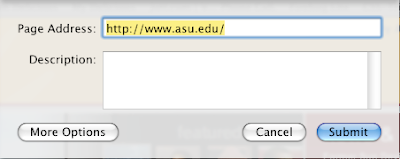
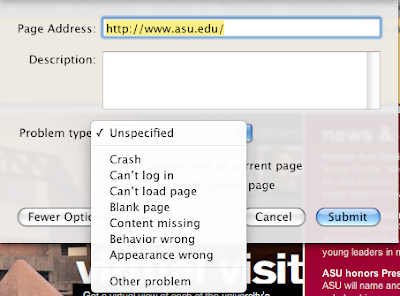
There are a lot a ways to get feedback. But I believe taking the simple approach and learn from things around us is always. I found Apple did something I really liked on the topic. Apple is not a premiere company on usability. I actually believe there ability to lead is hampered by elitism. But they do create good things from time-to-time. The feedback function on their new Safari beta app is a great example.
Immediate feedback is a good source of usability. Like surveys after a training, or clickers during a class. What Apple did was integrate this into a software app. They added this button in the top right of the beta app:
The button takes you to this window:
If you click on "More Options" you get this:
That is what I call usability in action.
- Clear, simple, and nimble way to get an opinion.
- Easy as picking up a pencil.
- The taxonomy/structured content is the second option, not the first.
April 12, 2009

April 9, 2009
Need Documentation....
I now believe the request for documentation is the first sign a system has bad usability. Documentation is what people go to first for a product that is not intuitive or easy to use. It is also the first response we give people. . .
"Did you follow the directions?" they say.
Putting lack of usability on the user is horrible and only makes people upset and frustrated.
April 8, 2009
....my working definition I found on the web
Usability is the idea that software or website features should be designed with the user in mind. Don't make blind assumptions about how your users will interact with your product. Inform your design decisions with data based on user testing of a variety of sorts.
The most important part of this idea, of course, is determining who your users are. Based on a number of types of information and research, you must try to come up with a user type, or possibly one primary and one secondary user type. From there, you create personas, sort of a character sketch of your user. This becomes the building block of your usability process - you keep these personas in mind when developing initial design ideas, and when recruiting the kind of people you want to test those designs.
The most important part of this idea, of course, is determining who your users are. Based on a number of types of information and research, you must try to come up with a user type, or possibly one primary and one secondary user type. From there, you create personas, sort of a character sketch of your user. This becomes the building block of your usability process - you keep these personas in mind when developing initial design ideas, and when recruiting the kind of people you want to test those designs.
The image of the quest.....
I took this photo with my phone on 5.18.2007:

Yes.....I've been thinking about this for a long time. Especially on how we can communicate efficiently. Some do it "in your face" as photo above, others want to use a more subliminal "nudge'' to advance values.
- But how much is too much?
- When is it too little and leaves people feeling lost?
- How do you find the most efficient method or circle of a target population?
- How do trends and stats play a part?
- How does diversity influence this?
- We have recently seen the explosion of social networks on the Internet. How does the human desire for community and affinity play a part? (Click here then on the '2009-4-5 Viral: Community' video podcast of a service I attended.)
Subscribe to:
Comments (Atom)


